 Skip to content


Choosing the Perfect Fonts for Backlit Storefront Signs: A Comprehensive Guide
When it comes to creating an eye-catching and impactful storefront sign, choosing the right font is crucial. Backlit storefront signs, in particular, offer a unique opportunity to captivate passersby with their illuminated appeal.
Importance of Font Selection:
The font you choose for your backlit storefront sign can significantly impact its visibility, readability, and overall effectiveness. It should align with your brand identity, convey the right message, and be easily legible from a distance. By considering the following factors, you can make an informed decision that maximizes the impact of your storefront sign.
Legibility and Readability:
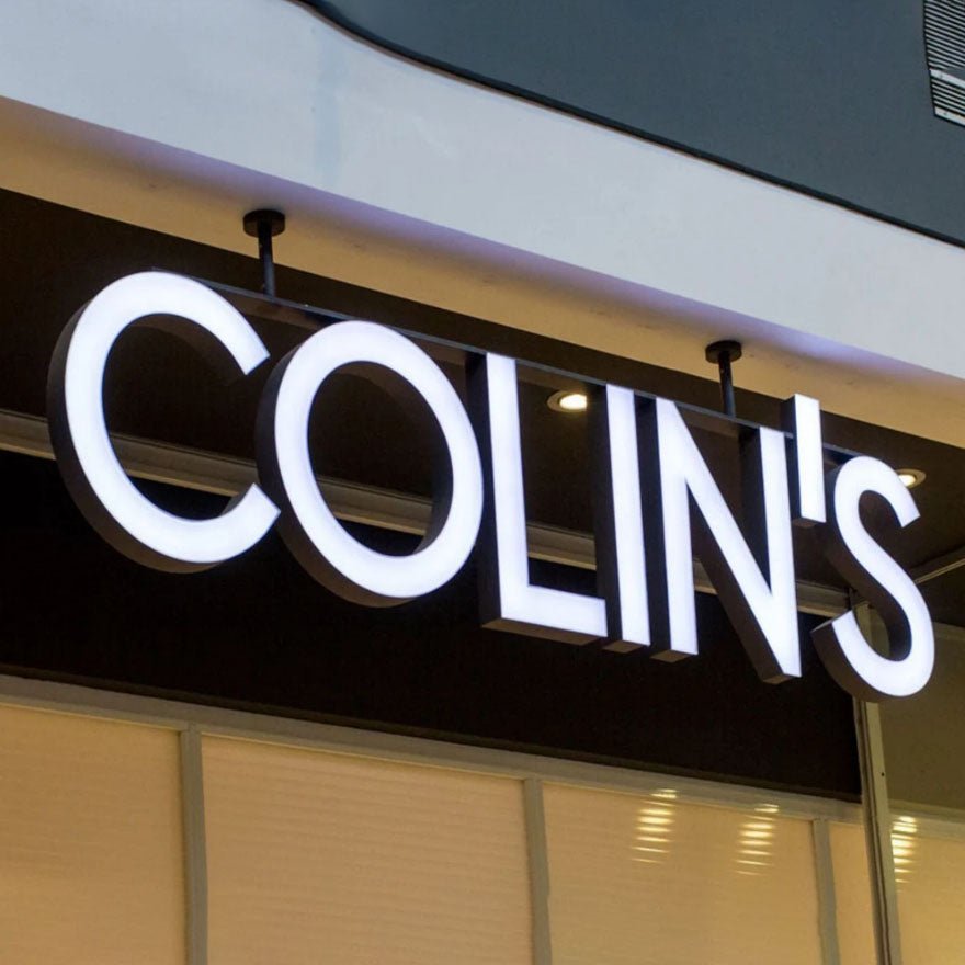
When it comes to backlit storefront signs, legibility is paramount. Opt for fonts that are clear, easy to read, and have a balanced proportion of stroke thickness. Sans-serif fonts like Arial, Helvetica, and Futura are popular choices due to their clean and modern appearance. These fonts are highly legible, even from a distance, making them ideal for backlit signs.
Brand Consistency:
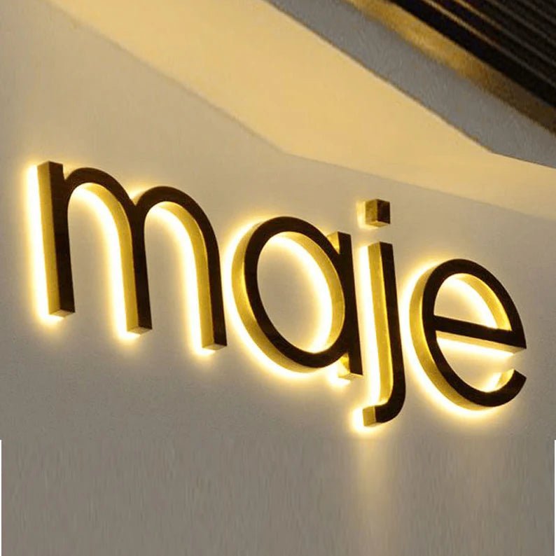
Your storefront sign should reflect your brand's personality and values. Consider using fonts that align with your existing branding elements, such as your logo or website. This consistency helps reinforce your brand identity and creates a cohesive visual experience for your customers.
Impactful and Eye-Catching Fonts:
While legibility is crucial, it's also essential to choose a font that grabs attention and stands out from the competition. Bold and unique fonts like Impact, Bebas Neue, or Gotham can add a touch of personality and make your storefront sign more memorable. However, ensure that the font you choose doesn't compromise readability.
Size and Scaling:
The size of your font plays a vital role in ensuring visibility. Opt for larger font sizes to ensure readability from a distance. Consider the viewing distance and the surrounding environment when determining the appropriate font size for your backlit storefront sign. Additionally, ensure that the font scales well across different sign dimensions to maintain legibility.
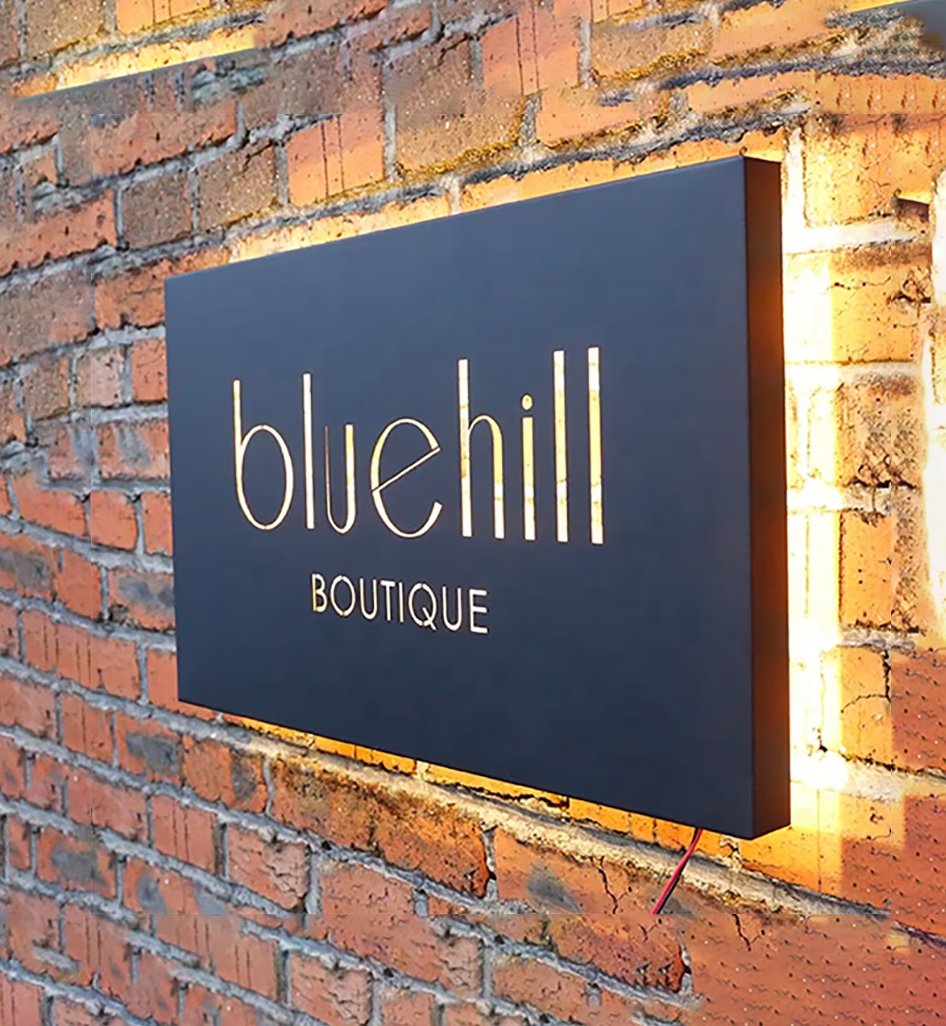
Contrast and Color:
The contrast between the font and the background is crucial for readability. Choose colors that create a strong contrast, such as white or light-colored fonts on a dark background or vice versa. Avoid using colors that blend into the background or make the text difficult to read.
The best font for your backlit storefront sign is one that aligns with your brand, captures attention, and is easily readable from a distance. Take the time to experiment, seek professional advice if needed, and create a sign that leaves a lasting impression on anyone who passes by.
Contact BacklitLEDsign to learn more about our wide range of store front sign options. Or, request a quote today to get started on your sign project.